Step By Step - Tumblr Posts
Art, “Hold them for me, Edward.” Process:
Hello guys and welcome to Sweet and her silly art hehe, since I have not made new projects lately, I thought it would be nice for me to share with you my process for that art.
So. Let’s start!!
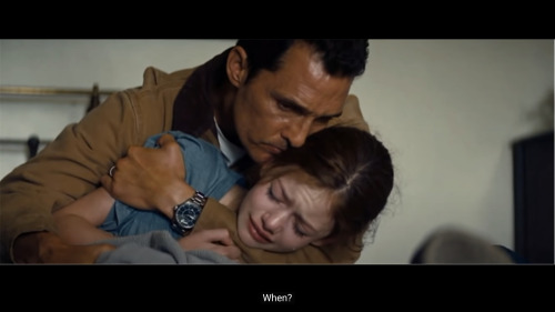
First thing First, always pick a reference. I mentioned before that I saw Interstellar, and this clip just got to me. It is my favorite clip out of this whole movie 🥺❤️

Once I get the reference to procreate, I draw over it, creating these guidelines. This will act as my main reference.
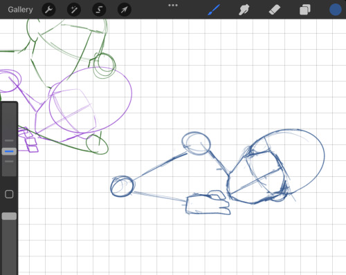
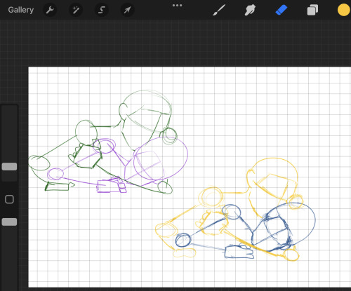
Then I start to draw the same guidelines on the other layer. The original one was traced, and so I draw mine and I try to make it as close to the original as possible. I also love using more then one color when I am at the sketching phase, it makes me understand my lines better and what thing belongs to what object.
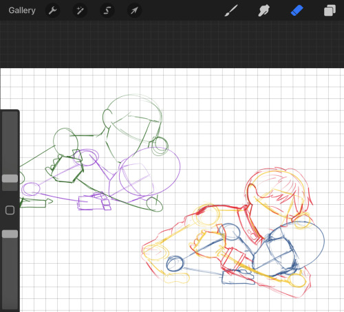
Once I have that done, I start transforming the guidelines into actual beings. This picture features Roy, sadly I didn't seem to get a pic for Ed, but yeah. I use the original photo of the movie to try get the same looks and try to see how the hair, clothes and facial expressions.
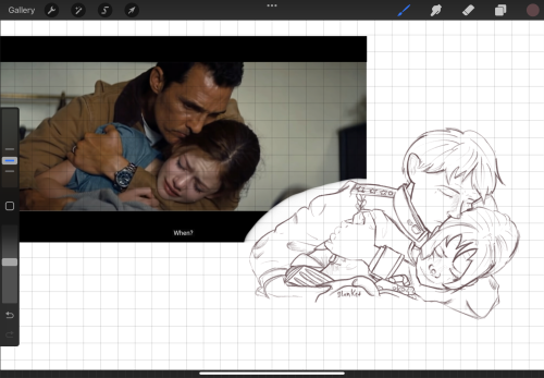
Then I do my outline! For my basic outline, I like to use a reddish-brown color, in this step, I like to add all of these soft details and try get the emotions in my vine out on the drawing
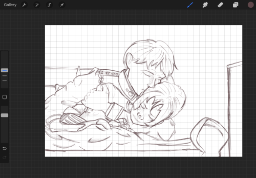
And when I have my objects done, I start building the scene, adding a blanket, a bed frame, a closet, etc, and once I am happy with the setting I add the small details to everything surrounding them.
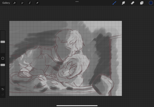
This was the first time I did something like this, which was understanding the shadows rather than just drawing arrows ( which Is what I normally do.) I don't think I will do the gray scaling again, simply because I just never found how it helps me haha
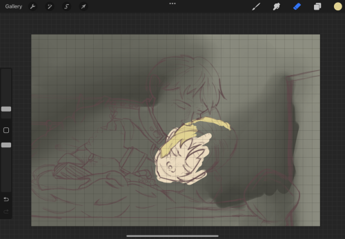
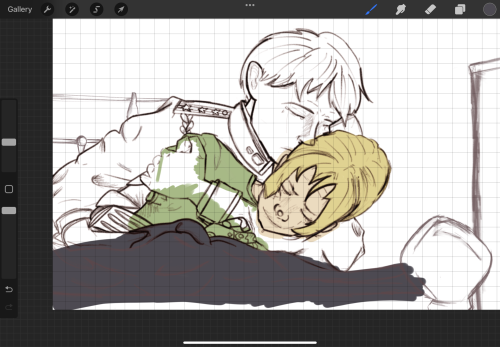
Here, there are 2 steps that are important to share.
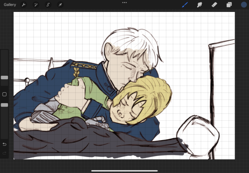
Step one, the outline. You can notice that it looks deeper and somewhat more darker! Thanks to a tip, my bestie Lynn gave me. Double your layer to 2 layers. The one on top, makes it black, and the one under make it red. The red layer changed to pin light and play with try obesity
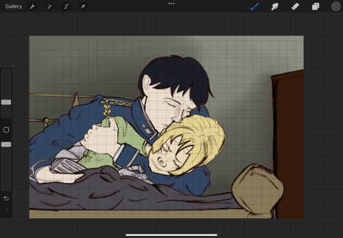
Step 2, I did my base colors, and I shaded the walls so I can start getting more of an idea about the shading
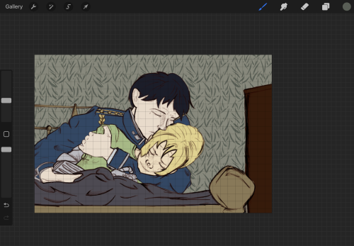
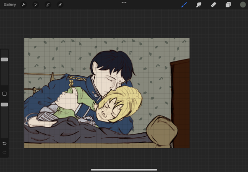
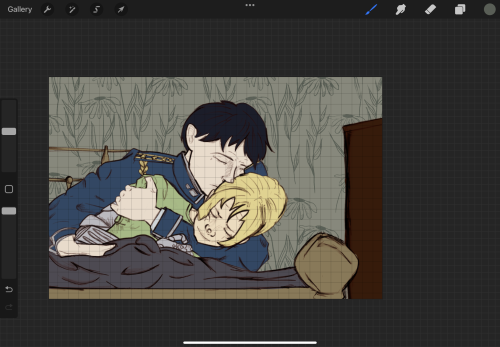
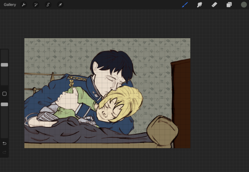
This step is a more decorative one, which is adding details to the walls. I just love using the different brushes and see what look I like best
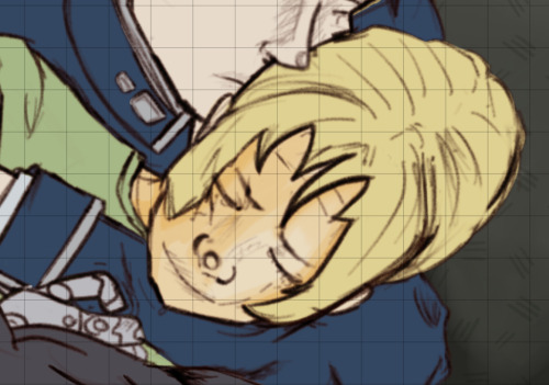

I started shading right after! Shading here was done differently from what I usually do

This is what I might do normally
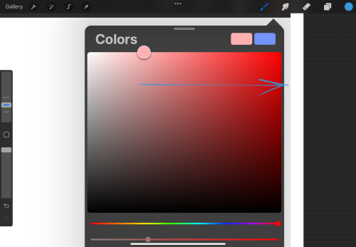
This is what I did this time!
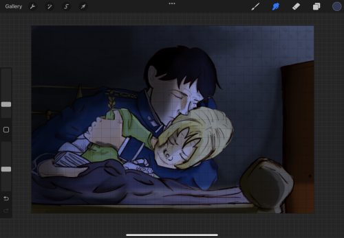
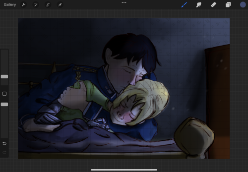
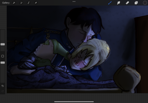
You can see in these 3 pictures I got the environment dimmer and darker, and I also added details like, Ed’s flushed fevered cheeks! I keep shading everything with a darker color then teh color I placed pm the whole layer. I used blues here and the mood was multiply
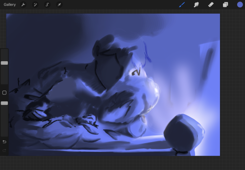
I added a light source because the drawing looked empty without it, and I used yellow! This is the blue in normal mood and the yellow is add and the soft light and etc
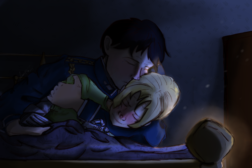
Opted to make the light a soft glow rather than harsh rays and TADA! This art was born hehe
I love it with my whole heart and I am so proud of how it turned out! If you are new here, hey there, if you liked my drawing, check out the fic that is based on it 👀
Hope my post helped some of you, if you have questions, let me know! Love you guys and see soonj
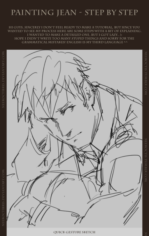
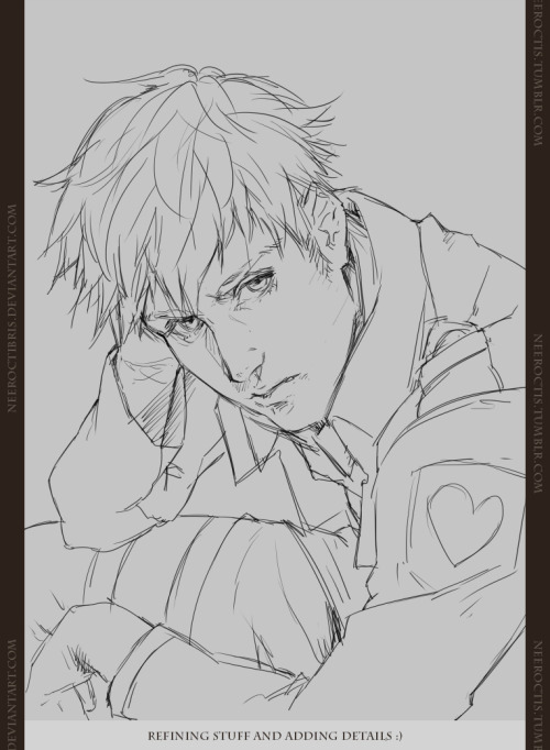
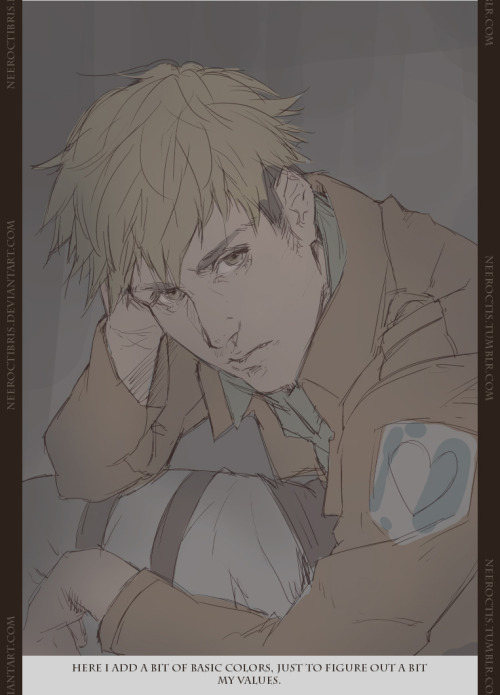

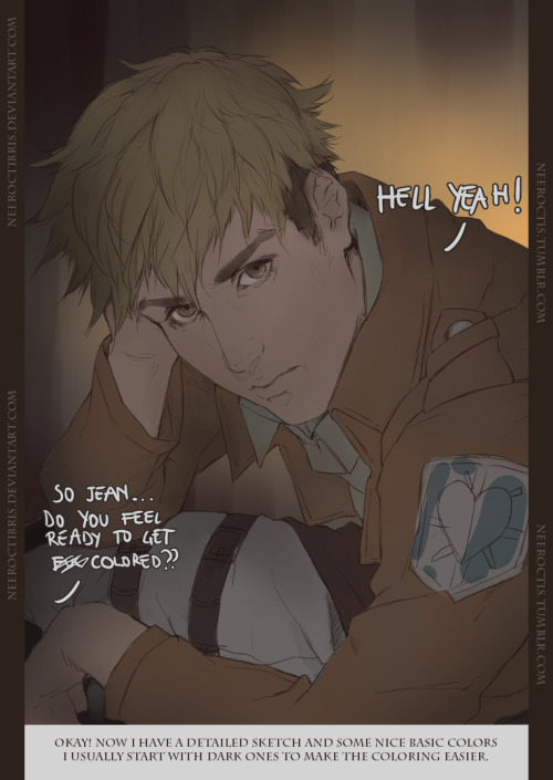
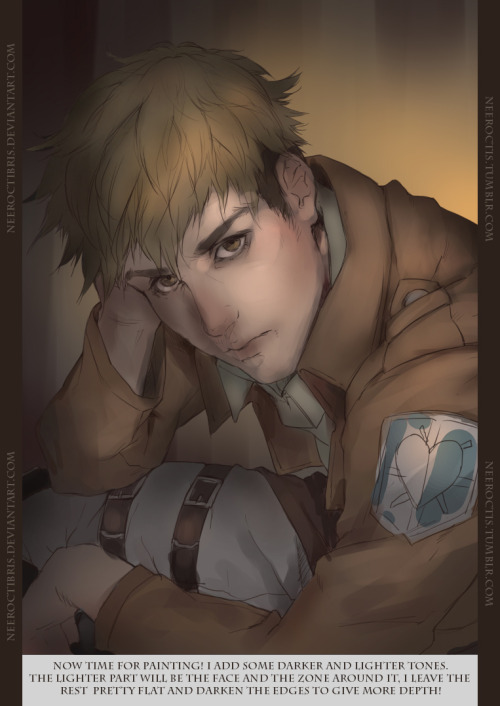
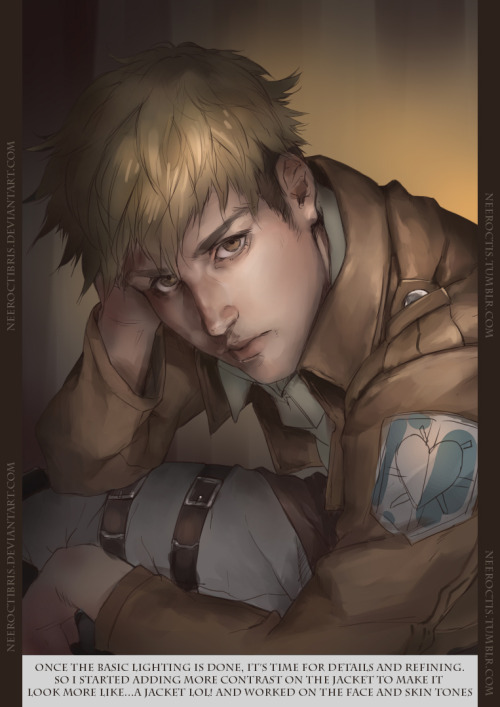
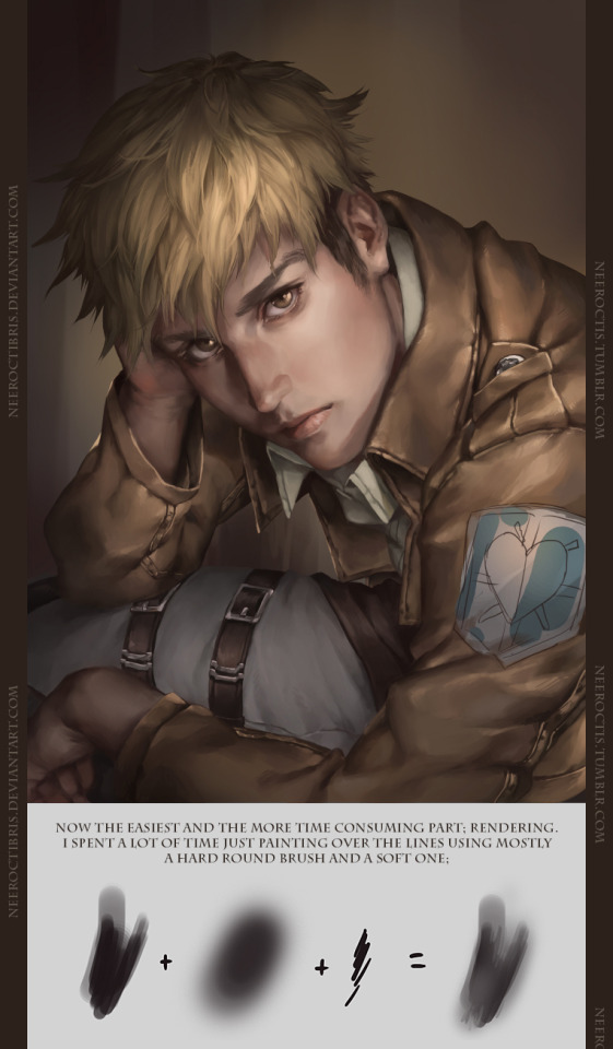
If you have any question just ask me and i’ll try to reply!! :3


ah, sorry for the bad quality gif, tumbler has some strict rules on how big a gif file you can upload ._.
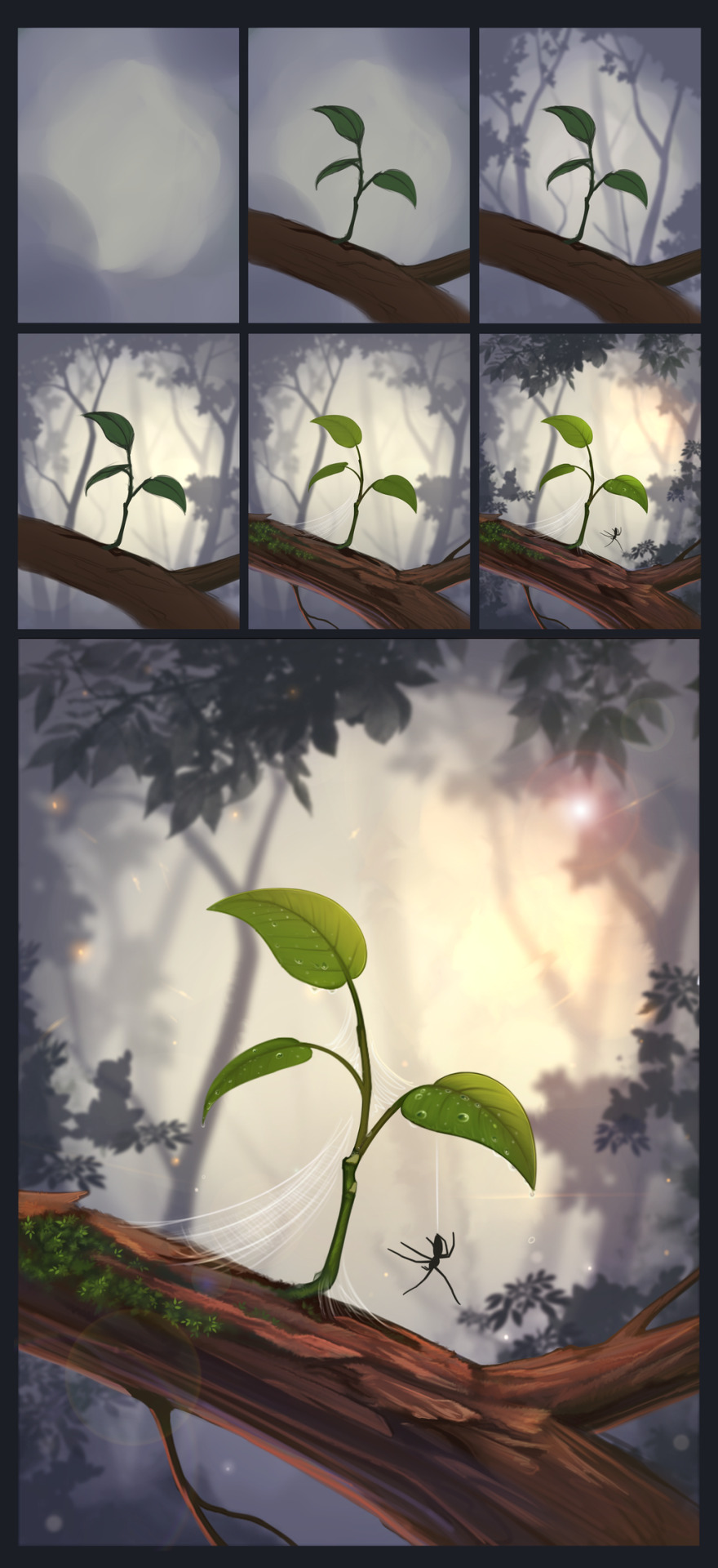
anyways trying out more stylist stile for This, started this as a sketch and colored it in Photoshop CS 6 : D
Deviantart


i hope this is readable omg
yea take this with a grain of salt because granted half the time i have no idea what im doing and yea
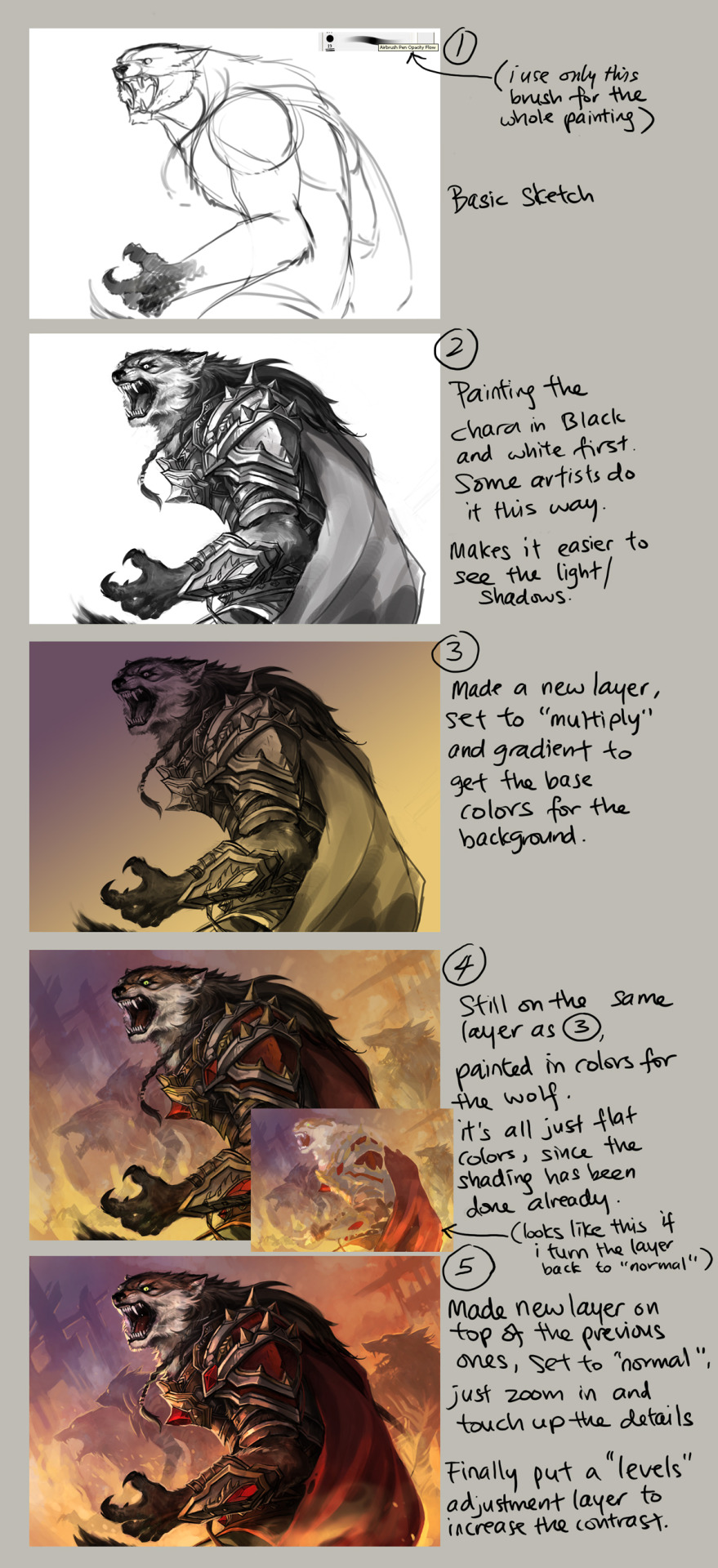
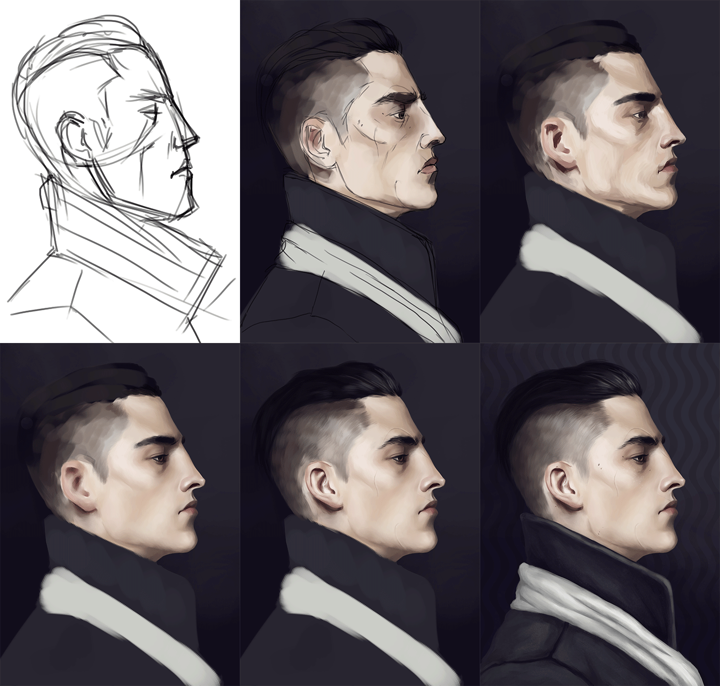
step by step explanation of this
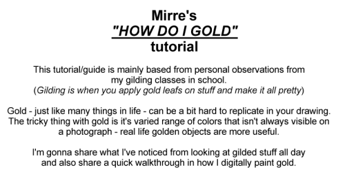
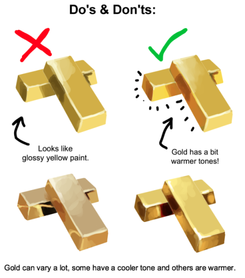
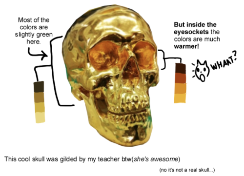
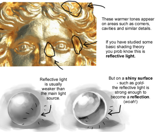
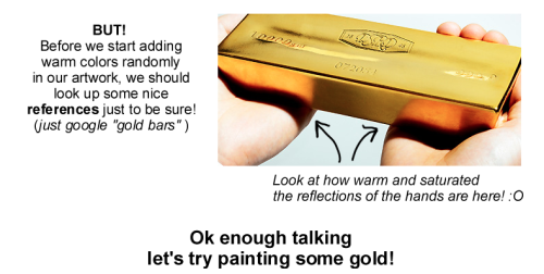
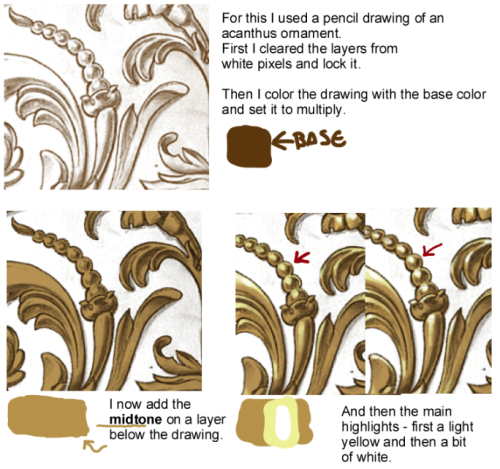
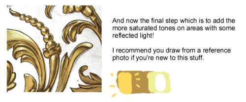
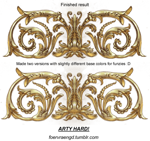
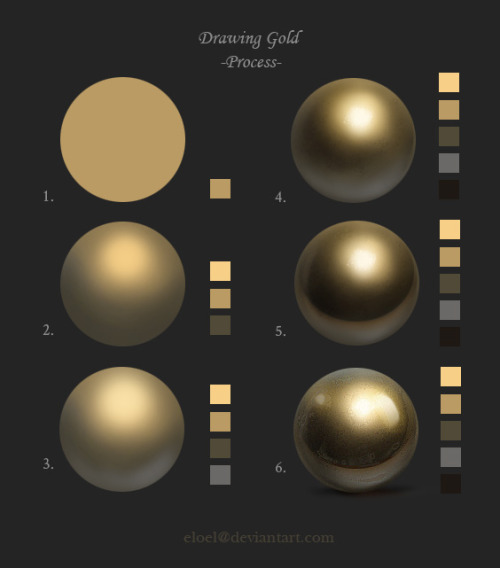
I spent hours staring at gold bars stock photos while making this and now my head hurts


Jonny Duddle illustrating Harry Potter during the Harry Potter Book Night.
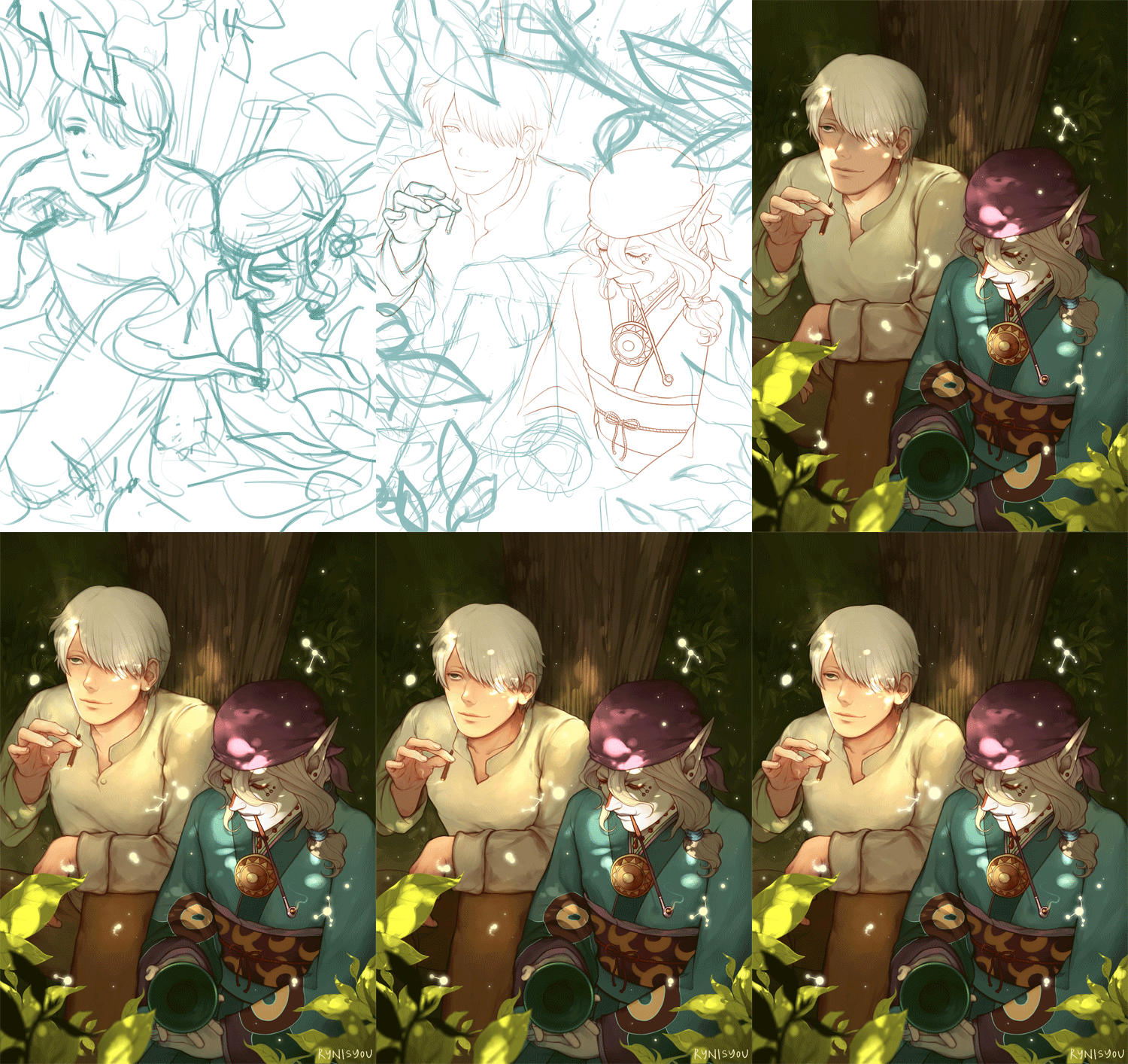
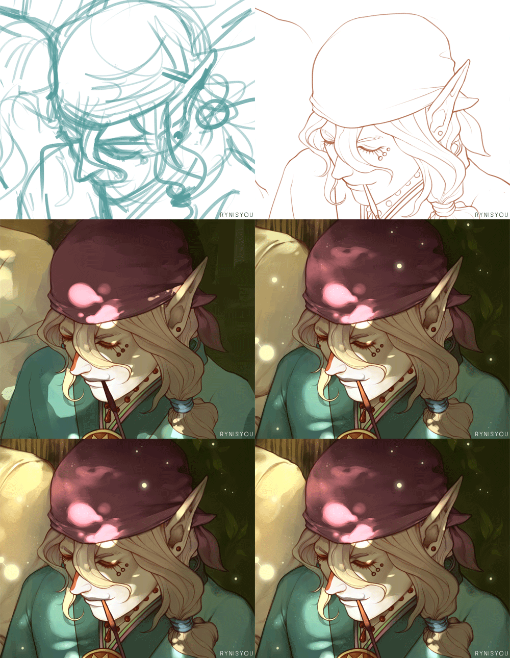
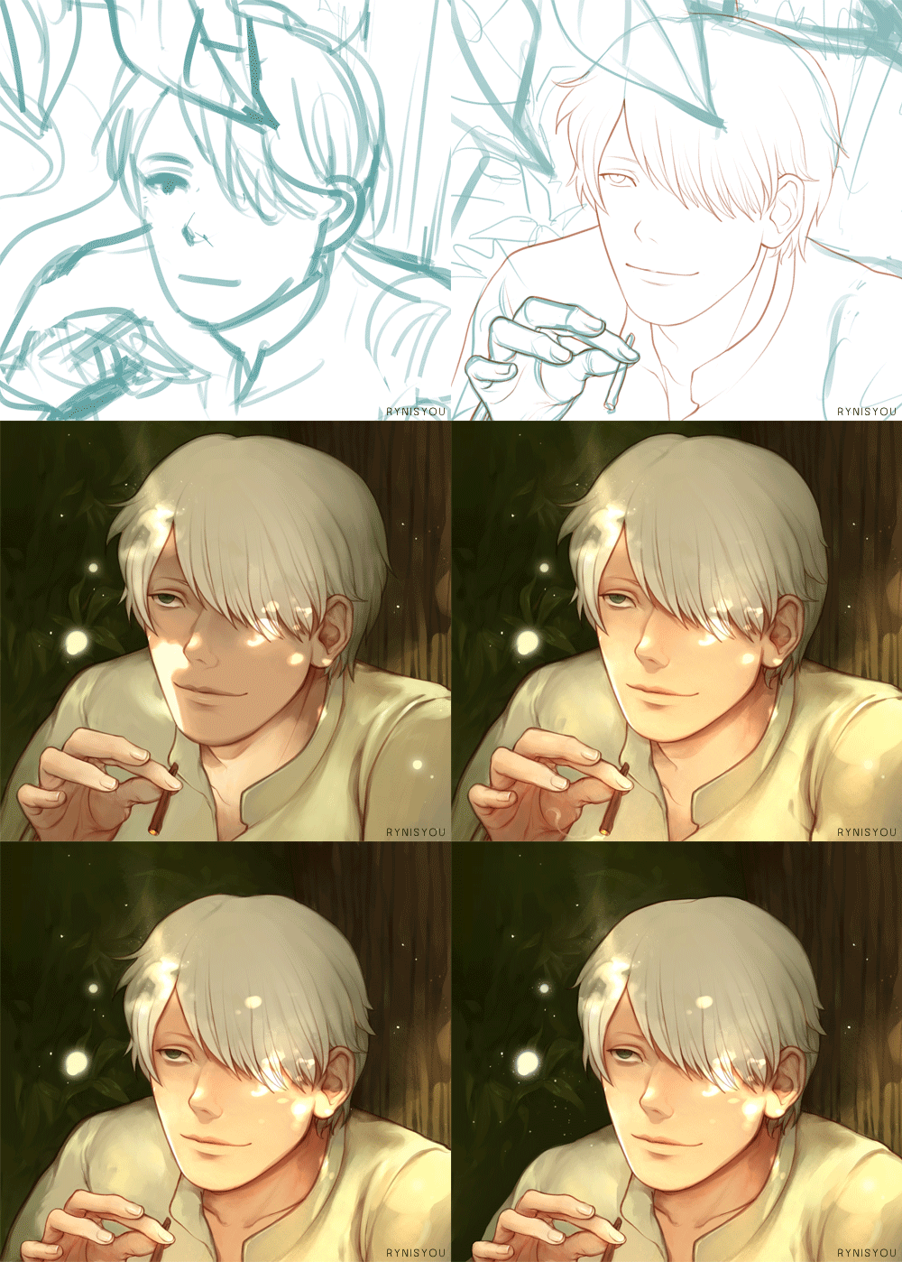
Mushishi | Mononoke process + portrait process. I hope it’s helpful (though I doubt it lol). Btw, happy holidays everyone :]
( Illustration | A5 print )
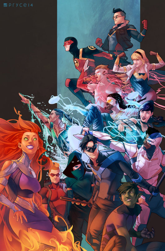
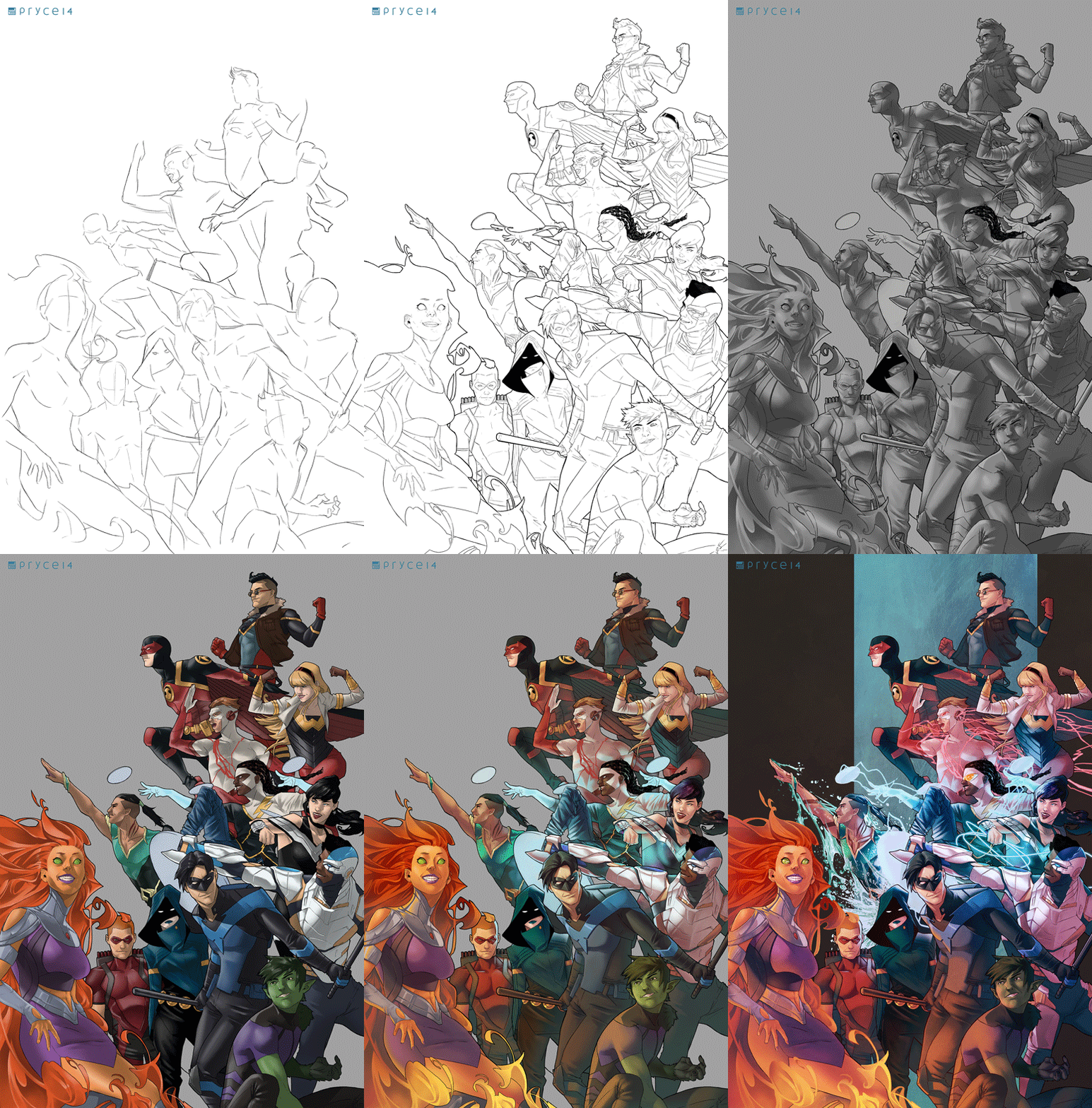
Teen Titans by Pryce14
Wanted to have a go at drawing a larger group and do redesigns of several of the characters, which eventually turned into me doing this Titans piece. (Regretting not putting in Wally now, but by the time I realized, I was pretty much done, unfortunately.)
Also included a gif of my process and layers, since I’ve had a couple people asking me about it.
Stumbled across your art recently, and I totally admire your work! As a complete noob to the digital art scene, I'd just like to ask whether you have any tips on colour picking (like for skin tones, under varied/dramatic lighting and such!). I have a ton of other things I want to ask, but I'll limit myself to one question and then try to google the rest, haha/ Thanks for sharing your art with us! ^^
ahh thank you so much! ♥ welcome to the digial art scene friend, i hope you enjoy your stay and ctrl + z
now onto your question! (if you don’t know what layer and layer modes are and how they generally work you should probably google that before you continue reading)
we all perceive colour differently (thx science) and i trust my intuition a lot when it comes to colour picking because of that, and also because i feel like you can make pretty much every colour combination work within the right context. context is key! but still, remember that all of this is about how i perceive colour, so you might not agree with everything i say.

here’s a quick rundown of terms you’ll see around a lot in reference to colours and shading: the hue, which is the ‘colour’ itself, the saturation aka the intensity, and the brightness [or value] which describes how dark or bright we perceive a colour to be.
rule of thumb: when you shade don’t just add black (or white) to your base colours, that will make your drawings boring and lifeless. use different hues and saturation!
now first things first: which skin colour does the character have?

you’ll mostly be navigating in the red to yellow spectrum for the skin tone. so when i pick the base colours i usually start with the skin and adjust the rest of the colours accordingly. if you’re not sure where to begin it might help if you first determine the values (brightness) of the base colours in grayscale.
and here are a few colour variations—i stuck to the approximate values but played around with a lot of different hues and levels of saturation.
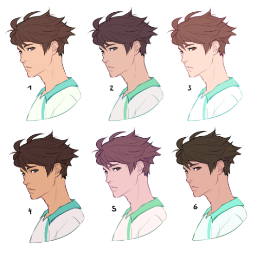
now compare 3 and 5: you’ll notice that 3 is very bright and leans towards orange hues, whereas 5 has a pinkish tint.

on the left i gave 5 the hair colour of 3 and in my opinion the pink hue of the skin doesn’t go well with the orange undertone of the hair. you’ll have to experiment a lot to find out which combinations work for you.
ctrl + u is your biggest friend (or image >> adjustments >> hue/saturation in photoshop, the shortcut works in sai and clip studio paint too). play with the sliders and see what happens. i do that a lot myself, because it’s easier to coordinate the colours like that afterwards instead of trying to manually pick perfectly matching ones right away.
for further adjustments i like to use an extra semi-transparent layer on top of everything with just a single colour to add atmospheric light. this unifies the colours and makes them more harmonious, if that’s what you’re looking for. this is about as far as i’d go if i didn’t want to shade the drawing.

if i do want to shade, especially with high contrasts and dramatic light, i darken the base by just adding an additional black layer, here set to 40% opacity. of course you could add a colour layer like the ones i mentioned previously too.


to create an impression of dramatic light you need a high contrast between light and dark areas (1). if i want additional visual intrest i often add secondary light which falls onto the main shadow areas. here i picked a faint greenish blue to balance out the yellow (2). and since light is at least partially reflected when it hits a surface you should add a faint glow that goes across the shadow/light border (3).
for this shading style i like to use the layer mode colour dodge with lowered opacity + fill settings. for some layer modes opacity and fill do the exact same thing (e.g. for multiply or screen). however for colour dodge there’s a big difference:

a lowered opacity merely alters the transparency of the entire layer. that looks pretty awful sometimes, because the bright orange affects the dark of the hair much more intensely than the already brighter skin. but when you lower the fill percentage you primarily lower the amount of light that falls onto darker colours. so the layer’s opacity setting treats every colour equally whereas the fill setting takes their values into consideration. it might be hard to understand if you don’t try it out yourself, so just play around to get a feel for how it works!
and to summarise, here’s a process gif:

colour is an extremely big topic and i’ve only barely scratched the surface but i hope that still helped you out a little! the fastest way to learn is always to try things yourself, so grab a sketch and experiment. 👍
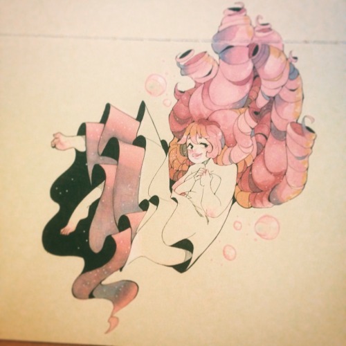
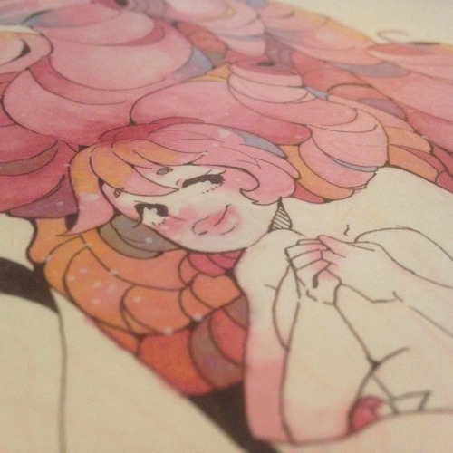
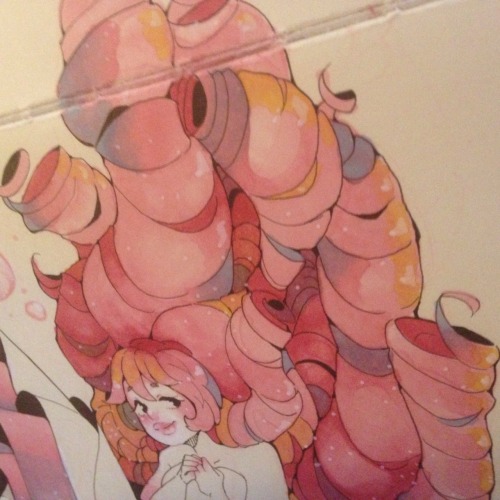
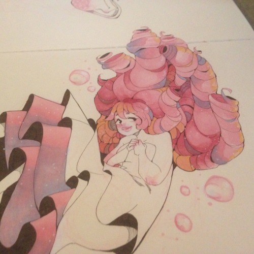
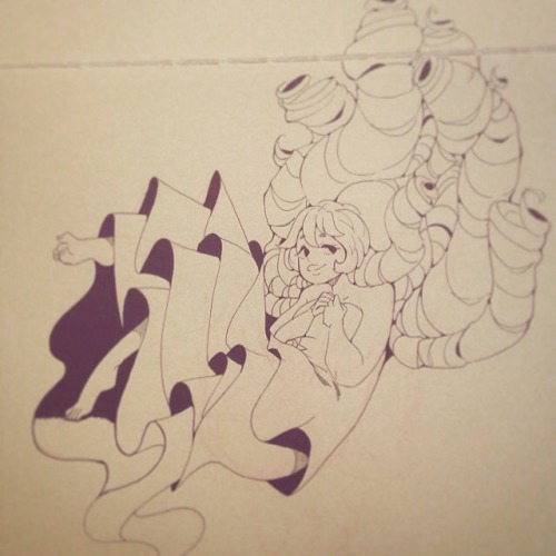
colours make me happy ;;v;;
- copic pens in black; Sakura pen-touch in White; copic markers in Rose Pink (R81), Rose Red (R82), Caio Buttercup Yellow (Y21), Baby Blue (B21), and Colourless Blender (0) -
will you upload progress pics of your art? e.g. from rough sketches till you colour it
I always use Overlay layer for my art.

Tone Layer + Overlay Layer

Celine! your work is beautiful! I really love that interior for Phantom of the Opera. What was your process for that?
Sorry I got back to this question so late, I wanted to take my time to organize the process.
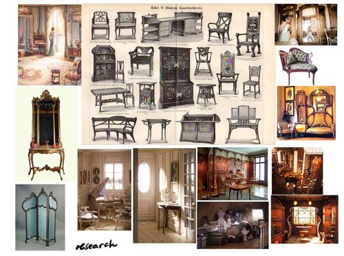
1.RESEARCH: I actually have tons of more images but these are my main references. I tried to grasp the design and the lighting here.
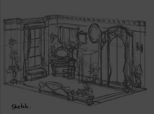
2. SUPER ROUGH SKETCH: Just to give me an idea of the design and the general placement of the furniture.
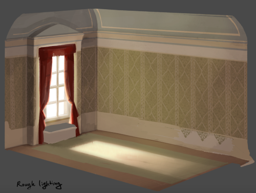
3. Rough Lighting: This is never a final but here I’m trying to find the right path to visualize the lighting+mood I had in mind.
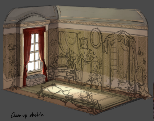
4. Clean up sketch: Tighten the shapes and details so that I don’t lose them when I paint.
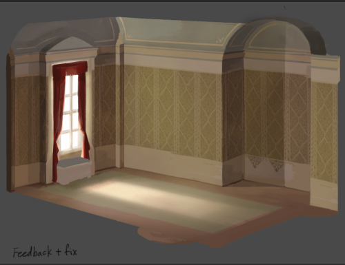
5. The all-mighty crit time: After a crit+suggestions I went through some major construction change to give the room more interesting shape.
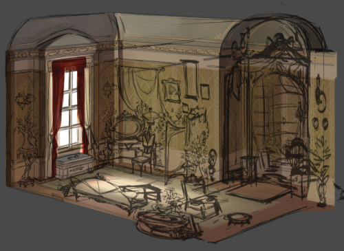
6. Re-sketch: I added some other furniture thinking more about the eye-path and variety of size and shape.
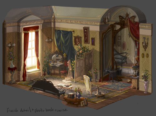
7. Finishing~: Yup. Basically detailing and photobashing, really trying to aim for the mood I want for this environment!
So…this is pretty it hope I answered it well!
Some resources
Please keep in mind I’m not an expert, I don’t draw/paint professionally, there are way too many things I don’t know about, so I can only tell you what I do, what I use etc.
One of the first things I did, and something that actually made me want to get better at drawing, was subscribing to Stan Prokopenko’s channel. He’s absolutely hilarious and he illustrates in a simple way Andrew Loomis’ techniques, general anatomy, gesture drawing etc (I’ve already written about this but seriously, he’s the best).
Since you have to train your eye as well as your hand, gather and produce as many references and resources as possible. What you should avoid doing is using them mindlessly. Force yourself to break down the world in simple shapes, and always ask yourself why a certain thing looks that particular way (“the elbow looks like that because they’re bending their arm, otherwise it would look like that”, or “there’s a whole set of muscles that protrudes when they lift their arm” etc).
Anyway the topic is huge, I’m definitely forgetting tons of stuff, but I hope this will be helpful in some way. Here’s the links! And if I can be useful in any other way, my askbox is always open.
Stan Propokenko’s channel x
Andrew Loomis’ books x x
Useful ways of using references x x x x
3D models x
FunkyMonkey1945 notes x
Griz and Norm’s Tuesday tips x
Anatoref x
Some of my favourite tutorials:
Full body breakdown x
Body types x
Gesture drawing x
Head and neck x
Arms and hands x x x x x
Torso and legs x x x
Legs and feet x x
Backgrounds and perspective x x
and lastly
Character Design References (aka neatly organized tutorials for literally ANYTHING) x
Note: these boards can be a bit overwhelming, so you’ll want to dip into them once you know exactly what you’re looking for. Otherwise you’ll just end up scrolling through them aimlessly.


Oh no it’s a COLOURING WALKTHROUGH
The last time I did one of these I felt it was inadequate because all I did was flip through the layers of a completed piece. So this time I took screenshots as I drew!
Other notes:
This is only my method for fast colouring; if I had, say, metallic objects, or fur to colour I would likely paint it with none of the shadows layer masking business, which seems to work best on objects that aren’t particularly shiny.
If you look at the timestamps, apparently I took about an hour an a half to colour this.
Smoothing out the shadows was done with a hard round brush with flow and opacity controls turned on. (it’s a default brush.)
Your flat colours are the most important part of this process - the layer adjustments trick will save you from having to pick a second round of colours for shadows manually, but if your flats aren’t up to scratch the whole piece will suffer. Make sure your colour scheme works here before moving to shading.
Finished product can be found here. I hope this is helpful!


